The program's logo.
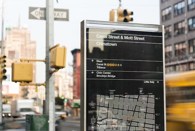
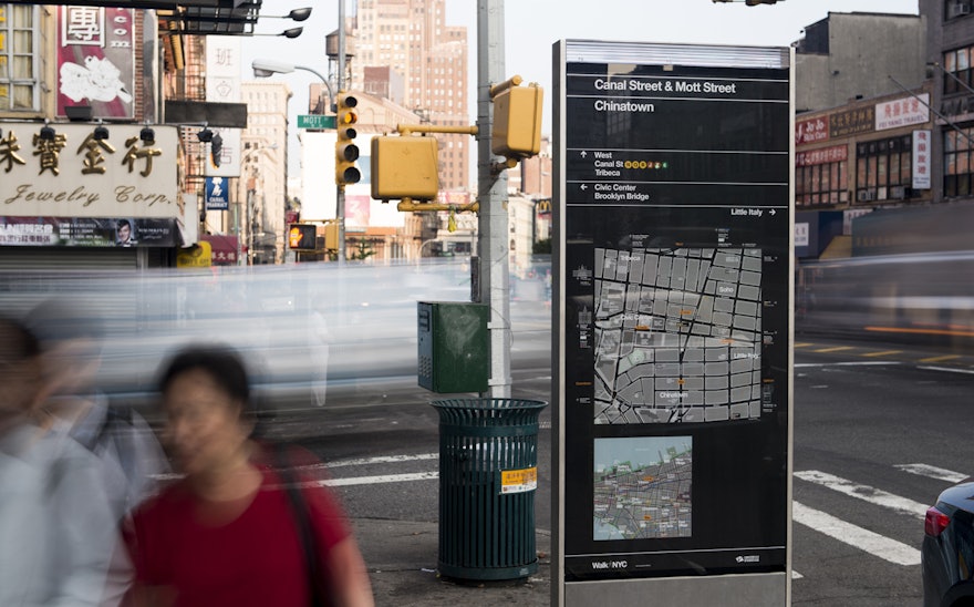
The signs are designed to guide users to public transit and major landmarks.
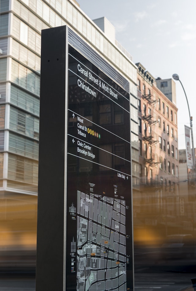
The kiosks designed by Billings Jackson echo the forms of the city's architecture.
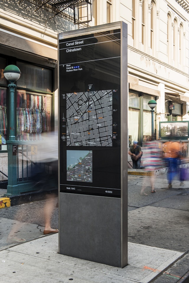
The kiosks present two maps, one of local streets and the other of the area's location in relation to the city.
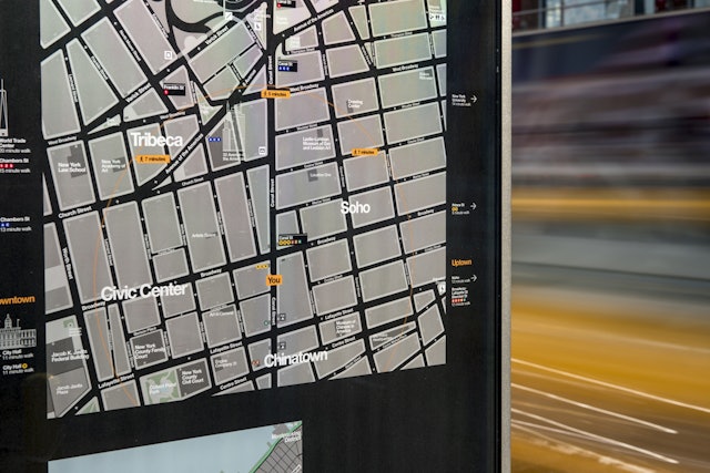
The maps use a 'heads up' orientation that corresponds to the direction the user is facing.
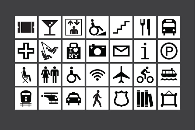
Icons for the program.
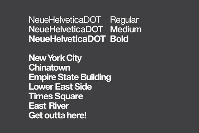
A customized version of Helvetica was created for the program.
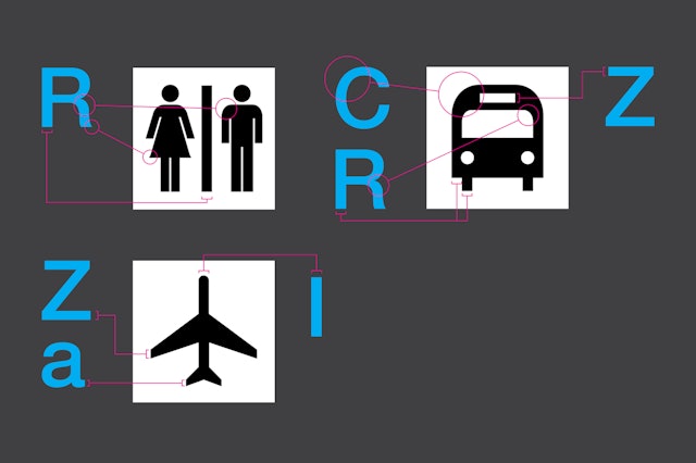
The icons were drawn to match details in 18 pt. Helvetica DOT.
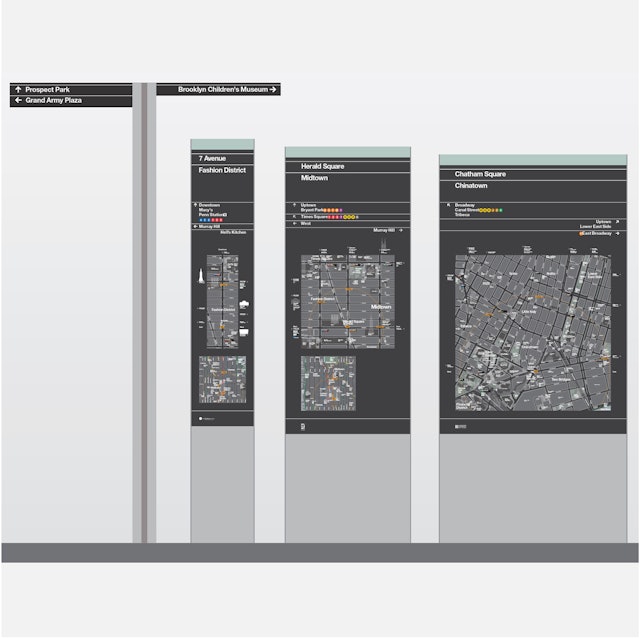
A range of signage types has been developed for different urban environments.
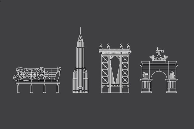
Icons for buildings and attractions around the city.
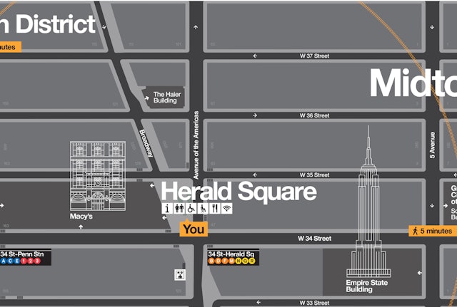
Landmarks are layered into other information on the map.

'You' icon that locates the user on the map.

The program's palette is inspired by the colors of the city.
