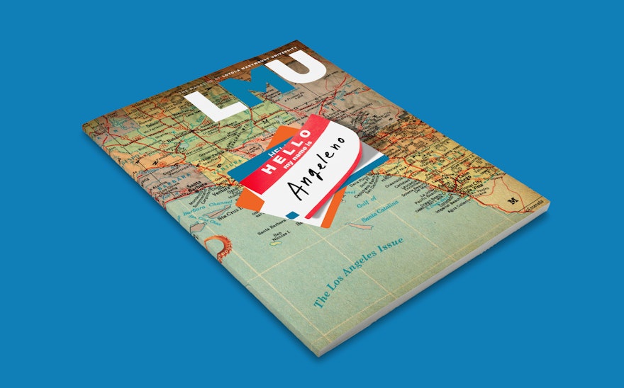
In 2009 the Austin office of Pentagram received a call from Maureen Pacino, Senior Director of Communications and Creative Services at Loyola Marymount University (LMU), with a request to redesign the university’s alumni magazine. The Los Angeles based Jesuit institution was looking for a complete rethinking of the publication called Vistas magazine at the time. The Austin office didn’t realize it initially but that unsolicited call was the beginning of a long, mutually beneficial partnership between Pentagram and LMU and it helped to jump-start Pentagram Austin’s extensive business in the higher education sector.
Prior to Pentagram’s involvement on the redesign of Vistas magazine LMU had commissioned an extensive analysis of the university’s constituency and its overall brand recognition. One of the recommendations from the researchers was a suggestion for the university to use the LMU acronym more frequently and prominently. The study pointed out that LMU, located in Southern California with prominent, acronym-using peers like USC (University of Southern California) and UCLA (University of California Los Angeles), wanted to be more readily identified by the LMU acronym but they weren’t there yet.
The Pentagram team pointed out the fact that “old-school” alumni magazines–print on paper–are still the most visible and effective communication tools available to colleges and universities today. With that in mind the design team recommended dropping the Vista’s moniker and adopting the new name LMU Magazine. The Vistas magazine name, a reference to the scenic views of downtown Los Angeles seen from the elevated bluff where the campus is located, had been around for decades but once the name change was considered it became obvious that there was no love for it. The name was changed to LMU Magazine and the new publication, designed and produced by Pentagram Austin quarterly, went on to win numerous editorial design awards and universal recognition as a model of journalistic excellence in the academic space. Now ten years later Pentagram Austin and the LMU Magazine staff have completed a second overhaul of the publication.
A major impetus for the redesign, other than the fact that all magazines need to be brushed up every five years or so, was the new brand identity adopted by LMU in 2019. The comprehensive identity system, also developed by Pentagram Austin, touches every entity in the university including administration, colleges and other academic units, associations, athletics and LMU’s sister institution Loyola Law School. Fresh off that year long initiative the Pentagram team redesigned the magazine with the goal of infusing the publication with the look and feel of the new identity system.
The refreshed LMU Magazine architecture uses Metric and Lyon, the two primary typefaces in the new LMU identity system. Metric, developed by the Klim Type Foundry in New Zealand, is a confident sans-serif typeface inspired by West Berlin street signs and Lyon, a contemporary Roman typeface published through Commercial Type, was designed by German designer Kai Bernau and made its debut in the New York Times Magazine in 2009.
The launch issue of LMU Magazine’s redesign, “The Los Angeles Issue,” is a special theme issue celebrating the unique culture and idiosyncrasies, good and bad, of the place LMU has called home since 1911. The tribute includes stories on earthquakes, garage bands, wildfires, storefront churches, homelessness, traffic, professional baseball, social justice and a feature about L.A.’s iconic Sepulveda Boulevard beautifully illustrated by Emiliano Ponzi. The wrap-around cover, and an accompanying six-page feature, showcases the collage work of Michael Waraksa for a story about the debate over what native Los Angeles residents call themselves–Angeleños, Angelenos or Angelinos.
The debate rages on in the pages of the new LMU Magazine!

