The University of Washington has been publishing an alumni magazine for the past 111 years. Stopping only briefly during World War I and again in the mid-1930s, the publication has persisted and become more relevant on campus and beyond. Pentagram Austin has redesigned and renamed the University of Washington Magazine in order to better reflect the prestigious Pacific Northwest institution’s legacy and influence on the state where it resides.
For years the magazine was called Columns, named for an architectural remnant located in the former downtown Seattle campus. However, the readership of the magazine now extends far beyond those insiders who understand that obscure reference. Pentagram Austin encouraged changing the publication’s name to University of Washington Magazine to declare unequivocally that this is THE flagship publication of the state’s leading university.
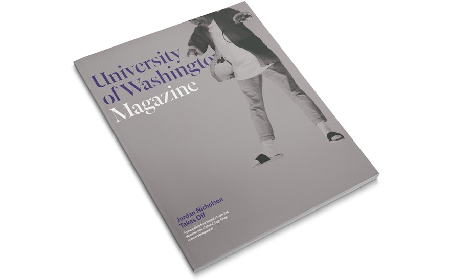
The new name of the magazine is a bit wordy, which could have posed a problem for the cover design. Instead, the Pentagram Austin team turned it into a distinctive masthead logo, typeset large on the cover in the attractive Roman typeface Independent Headline by A2-TYPE. The confidence of this typographic gesture is then seen throughout the magazine in large, distinctive titles opening each section. The robust font family, designed originally for the eponymous British newspaper, is used throughout the redesigned magazine with the sans, text and headline weights working together in harmony.
A proud part of the University of Washington legacy, the magazine has a dedicated staff whose commitment to excellence in the editorial space is clear. In order to showcase the quality of storytelling and editorial art, Pentagram Austin designed a flexible framework for the 72-page magazine’s layout. Allowing articles of widely varying lengths—long form news stories and short blurb updates, to all have a place. The redesign is type-driven in the news sections, with dedicated art-focused pages to help keep the content and pacing fresh for the reader. As a tip of the hat to the legacy of the magazine and its former title Columns, a simple vertical graphic device (like a column) is used to denote the stand-alone, art-driven pages. Illustration and photography are thoughtfully commissioned and art directed throughout the publication. Contributing artists in the redesign launch issue include Anthony Russo, David Plunkert, Olivier Kugler, Joe Anderson, Quinn Russell Brown and Jovelle Tamayo.
Redesigned into content groupings, each section of the magazine serves a distinct purpose. “Forward” opens each issue with opinion pieces from UW’s president, the editor and readers. A play on the literary term foreword, the section name references the university’s commitment to fostering innovative thinking. “The HUB,” a campus news section, carries the nickname of UW’s student union. These front-of-book sections bookend the feature-well with the alumni news and giving sections in the back. With purposefully similar structure to the front, readers find themselves in familiar visual territory in the back of the magazine. This layout signals to the reader that the section’s purpose is to deliver carefully crafted stories that feel guided—not overwhelmed—by the design of the magazine itself.
The structured nature of the front and back of the magazine allow the features to stand out. Drawing inspiration from the content of the stories, each feature is uniquely designed and cared for. Features in the redesign launch issue include a story about UW’s new Burke Museum photographed by Seattle resident Brian Smale, a piece about an intimate Filipino restaurant owned and run by UW alumni, and a first-person account of what it’s like to have your father run for president. The cover feature for the launch issue focused on a particularly vibrant alum—Seattle native Jordan Nicholson. Staff writer Julie Davidow’s story about the beloved photographer, artist and man-about-town, is elevated by personal, artistic photographs by Abdi Ibrahim. The feature includes hand-drawn typography and illustrations after Nicholson’s style.
The redesigned cover features one of Ibrahim’s photographs of Nicholson exuberantly leaping off the top of the page. Pentagram Austin designed this cover knowing it was a unique move for an alumni magazine (many of which are notoriously cautious in their art-direction) to show that University of Washington Magazine is here to make an impact.

