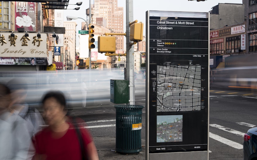
Finding one’s way through the streets of New York when coming up out of the subway or walking through an unfamiliar neighborhood can be confusing, even for the most seasoned New Yorker. In 2013, the New York City Department of Transportation introduced WalkNYC, a new program of pedestrian maps that makes it easier to navigate the city streets. DOT Commissioner Janette Sadik-Khan unveiled the initiative's first signs at a news conference in Chinatown, where four maps were installed over the weekend. In addition to Chinatown, the first phase of the program will be implemented this summer in Midtown Manhattan, Prospect Heights in Brooklyn, and Long Island City in Queens, with more to follow next year in other parts of the city. The maps are already installed on over 300 kiosks of the CitiBike bike-share program.
Pentagram helped create the graphic language of the maps, working on the project as part of PentaCityGroup, a special consortium of designers that also includes wayfinding specialists CityID, industrial designers Billings Jackson Design, engineers and urban planners RBA Group, and cartographers and geographic information specialists T-Kartor. The team worked closely with DOT and the city’s local Business Improvement Districts (BID) and other institutions and agencies to develop the program.
The maps are designed to encourage people to walk, bike and use public transit, and feature all local streets and major landmarks and destinations, as well as bike lanes. The kiosks will be located near subway stations, business districts and other high-traffic pedestrian areas, and the DOT is working with the Metropolitan Transit Authority to install the new maps in subway stations and at Select Bus Service stops.
Each side of the 8 ½ foot tall kiosks displays a large map of the streets within a 5-minute walking distance and another map showing the area in relation to a larger section of the city. The orientation of the WalkNYC maps uses “heads-up mapping,” in which north, south, east or west is rotated to correspond with the direction the user is facing. (If you’re facing south in Manhattan, the top of the map is downtown, and the bottom is uptown; on the other side of the map, the information is reversed.) The design was extensively tested with pedestrians, who found it easy to use; in the city, it is often hard to know which direction one is facing. (One study by the DOT found a third of New Yorkers didn’t know how to find north.)
Pentagram designed a unique system of icons for the maps, including the drawings of the landmark buildings. The graphics use a custom version of Helvetica created by Monotype for the program. Helvetica was chosen to complement the iconic graphic language of the New York City subway system, originally developed by Massimo Vignelli and Robert Noorda at Unimark. WalkNYC’s customized version, Helvetica DOT, makes all of the font’s square dots round, giving the program its own unique look.
A range of kiosk and signage types have been designed for the various urban environments and locations around the city (at intersections, mid-block, in plazas, etc.). The maps are printed on clear vinyl, which is applied to the second surface of the glass. The vinyl is easily removed and the glass reused for any updates to the map.
Pentagram also designed the graphic identity for the program. The logo appears at the bottom of the new signs, and will eventually be used to endorse any maps that use graphic language of the program as “official” city maps. City agencies and BIDs will be able to utilize the mapping system in their own communications, and will have the ability to add their own data layers to their printed maps. For example, the 34th Street Partnership could create a printed shopping directory map to give to visitors.
PentaCityGroup continues to work with the DOT on the next phases of the project, which will expand the system into additional neighborhoods and districts, as well as new print, mobile and digital media applications.
Pentagram previously worked with the DOT on the redesign of the city's parking signs and the LOOK! traffic safety campaign.

