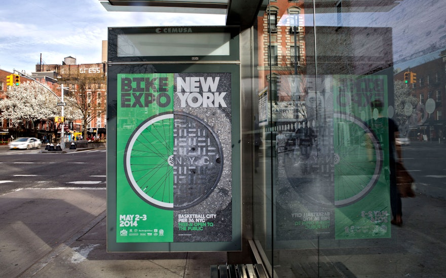
There’s nothing quite like experiencing New York City on a bike, especially on a beautiful spring day surrounded by thousands of fellow riders. The annual TD Five Boro Bike Tour, presented by the non-profit organization Bike New York, takes riders through New York's famous five boroughs. Pentagram has designed the graphics for this year's Tour, as well as the promotional campaign for Bike Expo New York, a two-day event that leads up to the big ride, and a new identity and website for Bike New York.
New York has become one of the world’s best cities for biking. With a growing network of over 900 miles of bike lanes and the Citi Bike bike-share program, cycling in the city is more popular than ever. Working in collaboration with community organizations and municipal agencies, Bike New York promotes cycling throughout the city as a safe and sustainable means of transit and recreation. The group provides free bicycle education classes for riders at all skill levels, as well as lessons in related topics like bike maintenance, commuting, and how to buy a bike. Last year the organization taught bike skills to over 16,000 New Yorkers.
The TD Five Boro Bike Tour is an iconic NYC event, and we wanted the promotional campaign to be as bold, immediate and powerful as the Tour itself. The campaign takes the point of view of riders on the journey, showing moments of the ride and directly tying into the experience. The Tour runs through all five boroughs, from Lower Manhattan up to the Bronx, across to Queens and Brooklyn, and finally over the Verrazano-Narrows Bridge into Staten Island. The campaign imagines a series of mile markers along the route and shows exactly what’s at that spot of the ride, like Central Park at Mile Five and the Queensboro Bridge at Mile 14. The images have been paired with taglines that capture the spirit of the moment at that point in the ride, such as “Take the Streets” at Mile 3 (Lower Manhattan) and “Crank It Up” at the Queensboro Bridge. The you-are-there images are photo-illustrations that integrate the distinctive typography of the new Bike New York identity with the pavement of the city streets.
The designers created signage for the actual mile markers along the route of the Tour, as well as over two dozen signs with playful messages to motivate riders, like “Where’s there’s a wheel there’s a way." The signs are meant to add to the enjoyment of the tour and show a bit of the perspective of a bicyclist in the city and of Bike New York as an organization.
The Tour and Expo campaigns and the upcoming Bike New York identity use the font Sharp Sans, which has been customized with a redrawn “I.” The grey and green palette is inspired by the color of the bike lanes and the asphalt of the streets. The Tour graphics use the green of the identity of TD Bank, the tour’s title sponsor. The Expo graphics employ a slightly different shade that matches the green of the bike lanes and will be used in the Bike New York identity.
The Tour graphics will appear on the bibs and helmets of riders in Sunday’s event. We also designed an the official map of the route, as well as icons for the different stops and amenities along like the ride like water stations, rest areas, and mile markers and bike repair stations. To convey the special relationship that people have with their bikes, the event guide features interviews with Tour cyclists alongside photographs of them with their bikes. The portraits were taken by Sam Polcer, a Brooklyn-based photographer who pays tribute to NYC cyclists in his new book New York Bike Style.

