Governors Island, the park in the middle of New York Harbor is open to the public all summer, with 172 acres of lush landscapes and picturesque paths where visitors can bike, picnic, lounge on hammocks, play sports, view art exhibitions, attend concerts and dance performances, and explore historic buildings. Reachable only by ferry, the Island is a serene, and somewhat surreal, escape from the bustle of the city.
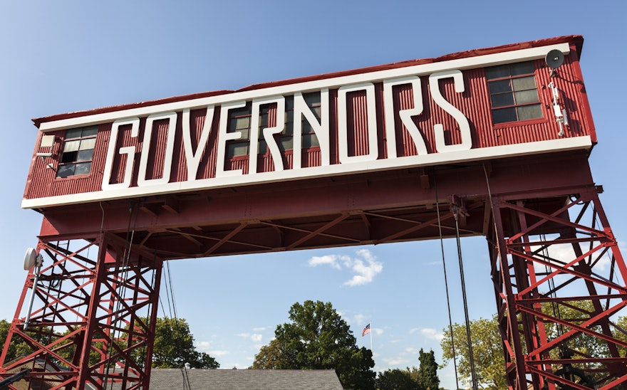
Pentagram has designed environmental graphics for Governors Island that enhance this unique sense of place. Inspired by the Island’s gantries—the giant skeletal superstructures that mark the docks and frame views to and from the site—the designers have created a system of transparent signage that preserves these views, even as it helps guide visitors around the Island. The designers collaborated on the program with West 8, the landscape architects for the Island’s regeneration, and Leslie Koch, president of the Trust for Governors Island.
For most of its history, Governors Island had very few visitors, a secret destination hiding in plain sight of millions of New Yorkers. The name dates to the British colonial era, when the Island was reserved for the exclusive use of New York’s royal governors. It served as a U.S. Army post from 1783 to 1966, then a U.S. Coast Guard installation from 1966 to 1996. (The abandoned military base remains on the Island, elegant and eerie.)
In 2003, most of the Island was transferred to the State and City of New York to be developed as a park. West 8's design was selected through a competition, and after ground was broken in 2010, various sections have been finished in time for each summer season. This year, 30 acres of new park were introduced, including Hammock Grove, a sunny 10-acre space that is home to 50 hammocks, and the Play Lawn, 14 acres for play that include two ball fields.
The Island’s astounding 360-degree views of Manhattan, Brooklyn, New York Harbor, and the Statue of the Liberty already serve to orient visitors as they move about its periphery. The Island has just two “front doors,” a dock for ferries from Manhattan (at Soissons Landing) and another for ferries from Brooklyn (at Yankee Pier). The enormous gantries at the docks provided the key to the design approach for the Island’s signs. The designers developed a system of welcome walls and district markers that incorporate dimensional typography into their gantry-like forms.
The see-through signs look robust but playful, big enough to stand out in the environment but capable of fading into the background. Adriaan Geuze, Jamie Maslyn Larson, and their team at West 8 helped create the structural design of the signs, including supports that incorporate the curvy, organic patterns that can be found throughout the park design.
The designers created a custom typeface for the graphics called Guppy Sans, a cross between a rugged sans serif (to reflect the Island’s utilitarian past) and an ornamental display font (to suggest the lush parkland to come). The typeface is a redrawn version of Agency that makes the hard-angled font, which has letterforms that look like they’ve been bent from a piece of metal, softer and more friendly. The curves of the font also echo the organic petal-shaped landscaping established in West 8’s design for the park.
Using the same custom typeface on every sign, including street signs, informational signs, and interpretive signs, the team hoped to create a distinct sense of place that would set the Island apart from other New York destinations. A custom set of icons was also developed.
A key challenge for the Island’s signage program was anticipating change. The signs had to look permanent, but needed to be updated weekly to accommodate changing events, and seasonally to incorporate new destinations. As a result, the signs are built from modular elements that can be easily modified. Names of locations can be switched out between the rails of the welcome walls and district markers, and modular panels can be updated with new maps, announcements and other information.
Koch believes strongly that memorable place names are fundamental to wayfinding. On the Island, some are historic (Colonels Row), while others are brand new (Hammock Grove); they build anticipation even as words on a map. Rendered in the distinctive Guppy Sans, the names are of a piece with the Island’s unique character.
The structure of the signs, and their location in the lush landscape of the Island’s park and open spaces, suggest they will eventually make excellent trellises, as the greenery of the park grows over time. Ultimately, the signs complement the unrivalled scenery of the Island, a place unlike any other in the city. Koch calls them “the most beautiful signs in New York.”

