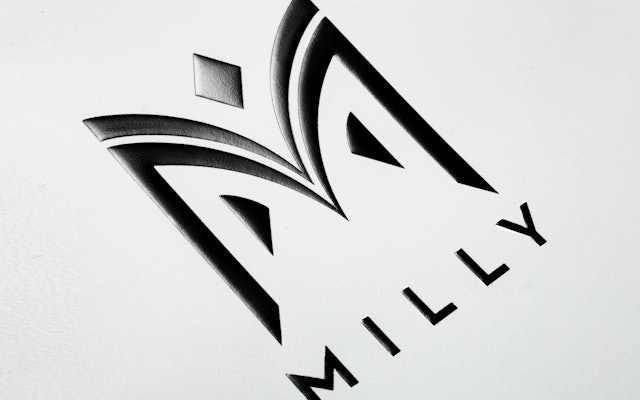
Zoom Enlarge Zoom Enlarge 1 Brand standards manual. Zoom Enlarge 1 Brand standards manual. Zoom Enlarge The mark is built around the symmetrical architectural forms of the letter M, balancing the strong bones and geometry of the letter with a series of fluid, organic curves and shapes. Learn more about the project Zoom Enlarge 1 Window displays at the Milly boutique in New York. Zoom Enlarge 1 Window displays at the Milly boutique in New York. 2 The new logotype on store awnings in New York. Zoom Enlarge 2 The new logotype on store awnings in New York. Zoom Enlarge Zoom Enlarge 1 The logo can be used in patterns on wrapping paper. Zoom Enlarge 2 The identity has been applied to a full range of collateral. 1 The logo can be used in patterns on wrapping paper. 2 The identity has been applied to a full range of collateral. 3 Fall show invite. Zoom Enlarge 3 Fall show invite. Zoom Enlarge Spring show invitation. Zoom Enlarge The liquid curves of the logo are juxtaposed by the logotype, which is set in Neutraface, a geometric sans serif typeface that is closely associated with mid-century Modernism, one of Smith’s historical influences. Learn more about the project Zoom Enlarge Clothing tag. Zoom Enlarge Digital look book. Share: Twitter, LinkedIn, Email