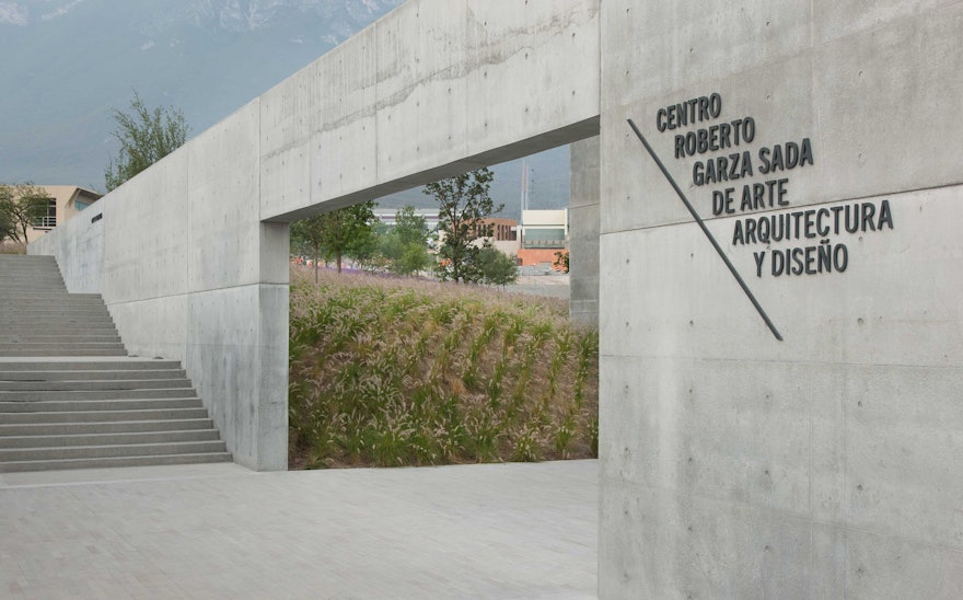
The building was conceived by Ando as a "Gate of Creation" that provides an entrance to the campus.
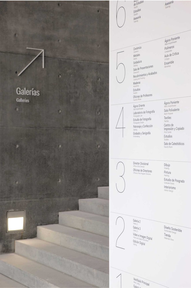
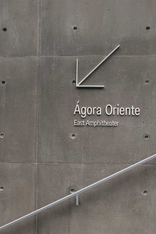
In contrast to the building's concrete, the environmental graphics are in shiny, smooth materials.
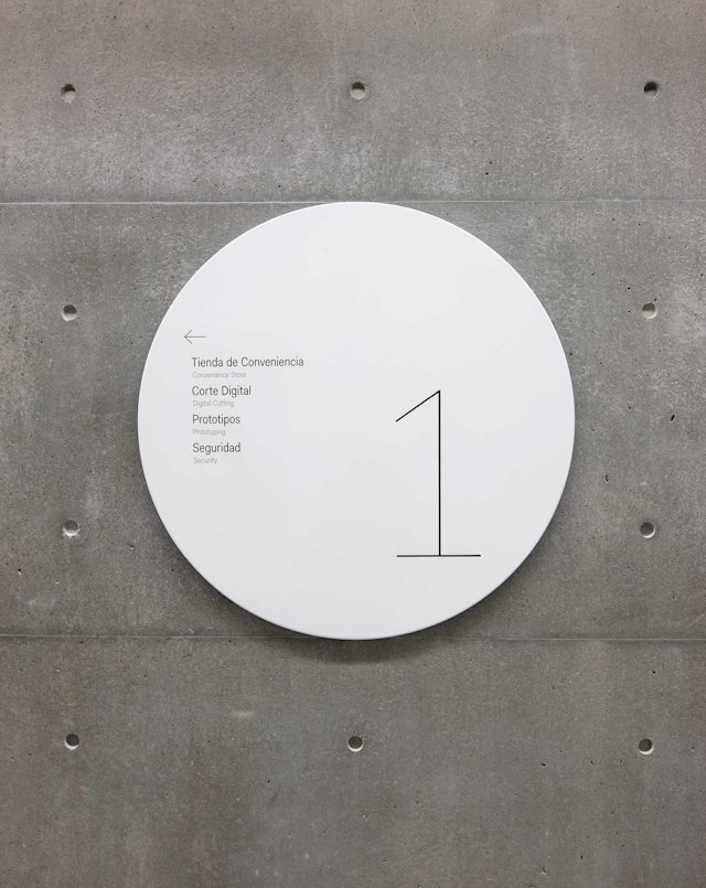
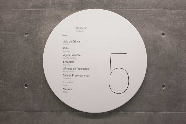
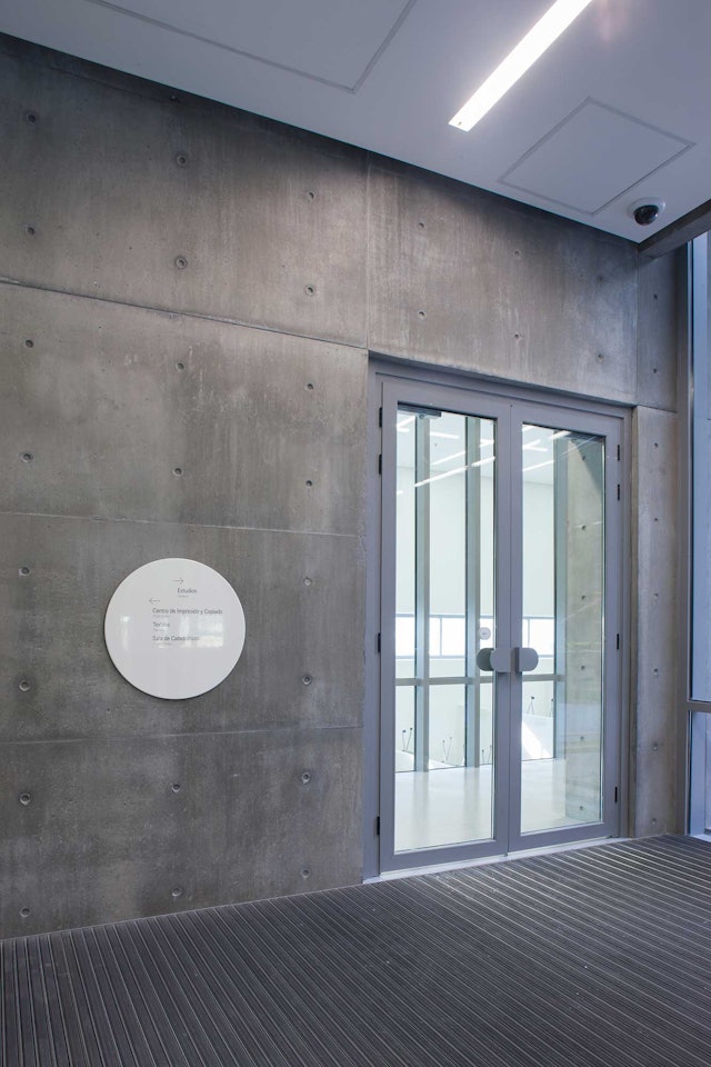
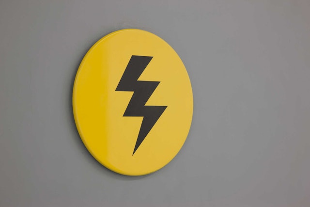
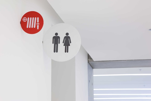
Wayfinding signage appears on shiny metal discs that stand in contrast to the building's walls.
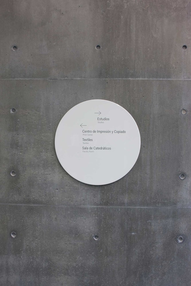
Typography is carefully composed on the simple circular shape and set in the Fakt font.
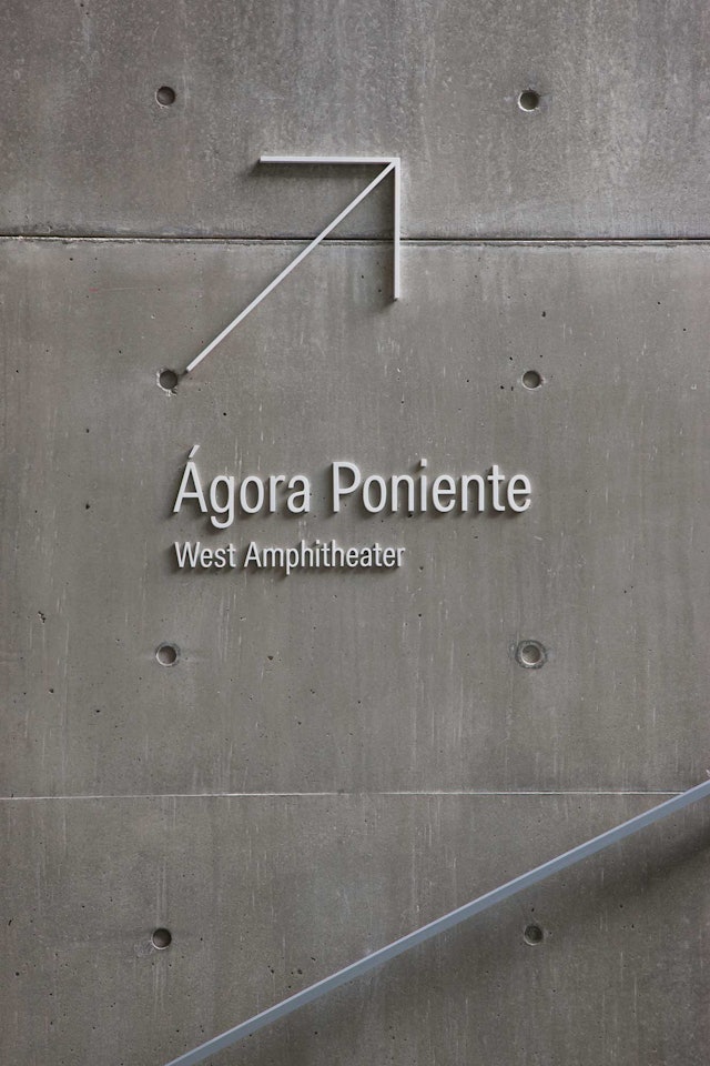
Arrows and slanted lines reference the building's dramatic diagonals.
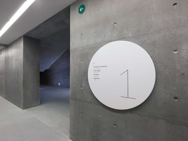
The shiny discs set off the raw beauty of the concrete and also complement the building's forms.
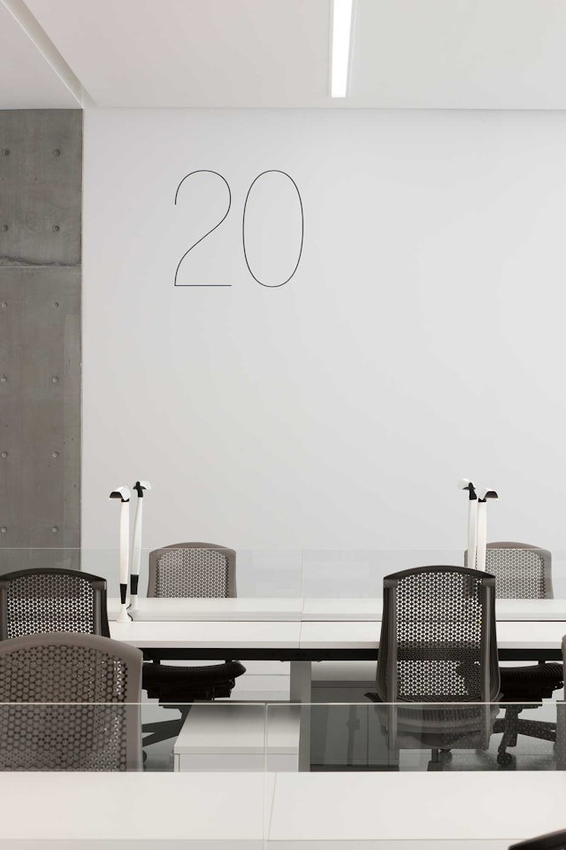
Studio workspace numbers are screened directly on the walls.
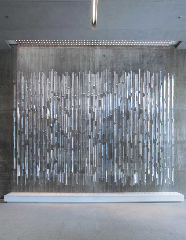
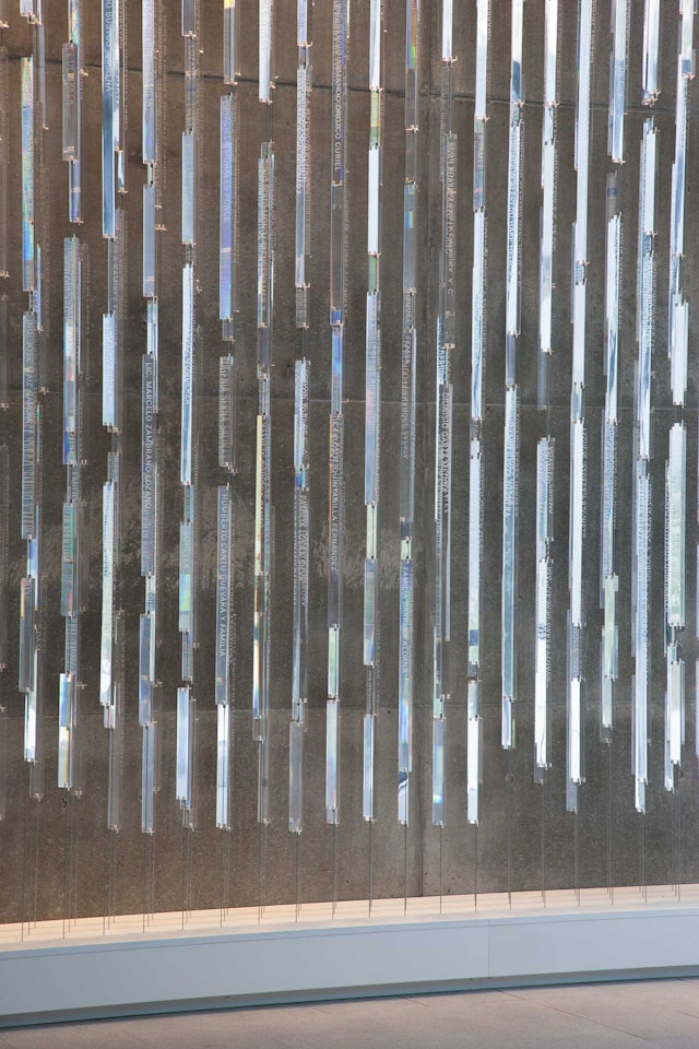
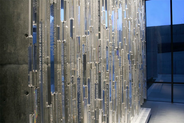
Donor recognition signage appears as a sculptural installation in the building's lobby.
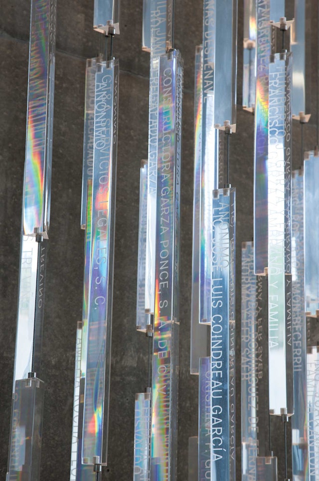
Names of donors are engraved on prism-like Plexiglas rods that change with the light.
