Pentagram

CEDIA

Interiors & Architecture, Exhibition Design

Exhibition design for the leading home technology association.

The visual language of the exhibit space was built around a series of four dramatic portals. Zoom Enlarge

The visual language of the exhibit space was built around a series of four dramatic portals.

The 50-feet long and 20-feet high portals functioned as open and inviting gateways into the exhibit. Zoom Enlarge

The 50-feet long and 20-feet high portals functioned as open and inviting gateways into the exhibit.

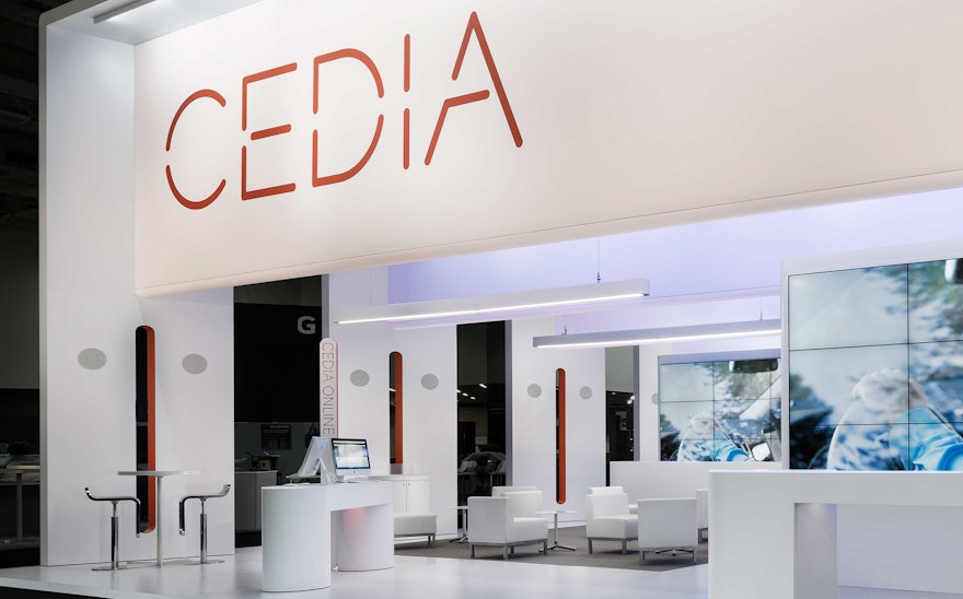
CEDIA unveiled its new brand identity at the trade show. Zoom Enlarge 1

CEDIA unveiled its new brand identity at the trade show.

The look and feel of the CEDIA exhibit design was extended to the convention center’s arrival halls. Zoom Enlarge 2

The look and feel of the CEDIA exhibit design was extended to the convention center’s arrival halls.

1 CEDIA unveiled its new brand identity at the trade show. 2 The look and feel of the CEDIA exhibit design was extended to the convention center’s arrival halls. 3 Exhibit plan.

Exhibit plan. Zoom Enlarge 3
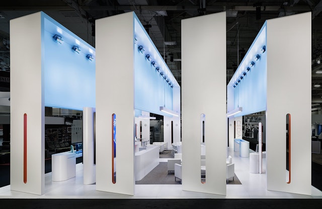
Exhibit plan.

The exhibit was oriented primarily to its long aisles, but designed to be welcoming from all sides. Zoom Enlarge

The exhibit was oriented primarily to its long aisles, but designed to be welcoming from all sides.
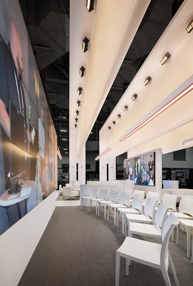
The interior contained spaces for both individual and communal experiences. Zoom Enlarge
The interior contained spaces for both individual and communal experiences.